Contrast, Size & Space Makes or Breaks Your Message
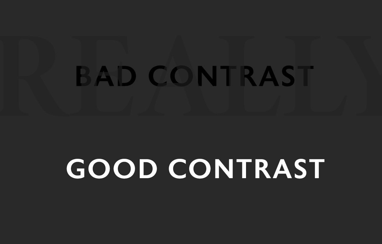
It’s always a shame when we see companies use and share designs with poor contrast. Dark text over dark backgrounds, busy images with bad color text overlays, and the likes. When poor contrast is present, a person’s eye will struggle to read the message, and in some cases, the text is just outright illegible. It’s a shame because in our line of work time is money. When we see poorly designed graphics, we see wasted money on ineffective design, missed opportunities in gaining viewers’ full attention, and poor execution in getting the message across. Lack of contrast is a very common mistake.
To have good contrast, and catch someone’s attention, your design must be strikingly different and easily legible to the fast-moving and ever-scanning eye. Once you achieve good contrast, other fundamental tips and tricks must come into play. Things like following the ‘Less-is-More’ clause in design theory, avoiding the largest fonts which can make the design visually scream from edge to edge, and leveraging the power of white space are also variables that strengthen an overall design. White Space, also referred to as negative space, allows less clutter and lets a design breathe. This is a big plus in Typography design and desktop publishing because increasing the *leading (*the space between rows of text) can greatly improve readability. Hence getting the message across clearly and effectively.
Having good contrast, being judicious on text size, and using white space in design helps control emotion and feeling in the overall layout. It’s not uncommon to have someone ask us to create the biggest, largest, wordiest designs ever, but educating those we help on these design principles allows us to produce good quality and beautiful end products that achieve their business goals. At My Media Designer, we enjoy creating and providing stunning graphics to locally-owned businesses that effectively engage their audiences. Every design has a reason, and we create them to achieve goals. CLICK HERE to see some of our recent Graph Design work, or CONTACT US if you have questions.


